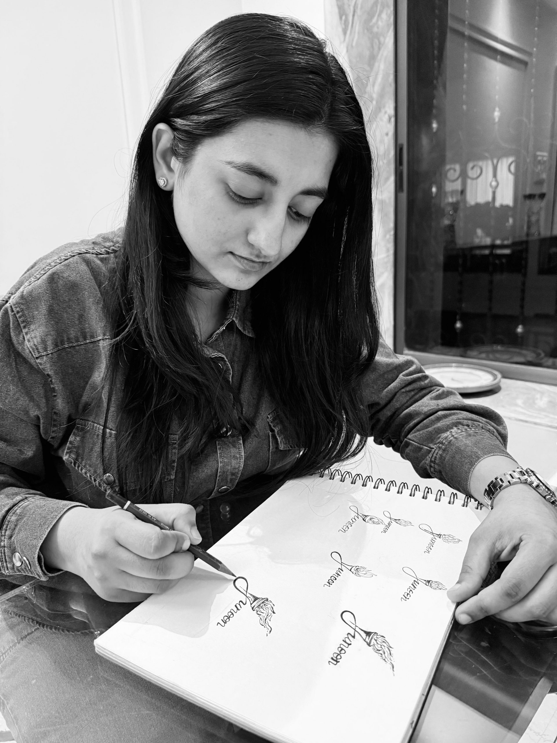
Anishka Paraswani, our Visual Art Advisor, gives us the story of our identity – our logo, our wordmark, our brand – hand-drawn by her – following a preliminary interaction and her resultant visualization. Her soulful contribution, earnest involvement and distinctive artistic input have served and strengthened us since inception.
I clearly remember the moment Junoon was first spoken into my world—through a phone call with Mythili. She described it not just as a Foundation, but as a dream in motion: a living, breathing space that preserves and passes on the ancient wisdom of the arts, specifically through Indian and Western Classical Dance. What struck me most was her belief in education through immersion—a system much like the Gurukul tradition, where learning is not transactional but transformational. The Junoon Foundation was that sacred space—a crucible where young girls from diverse backgrounds came to rediscover their roots, their voice, and their spirit through the Classical Arts.
As an artist, this conversation wasn’t just a briefing. It felt like an invitation into something far deeper—an ideology, a movement, a flame. Mythili asked me to begin sketching ideas for the logo, and I knew immediately that this wouldn’t be a conventional design process. This needed to carry the soul of Junoon. She told me to build around the word itself. Junoon — a word so rich in emotion, it almost speaks for itself. To me, it symbolized uncontainable passion, raw energy, discipline, and that sacred hunger to learn, give, and grow. It wasn’t just a name — it was a fire that lived in the body and spirit of every student who walked into the Gurukul we wanted to re-create.
I began thinking visually, letting these emotions and meanings take form. I kept returning to the image of a torch. Not just any torch—but the Olympic torch. It has always stood, to me, as a symbol of legacy—carrying light, endurance, and the passing of sacred responsibility. That’s exactly what happens in a Gurukul: knowledge is passed like a flame, from Guru to Shishya, not merely taught, but shared. That’s when it clicked— the letter “J” of Junoon could become the torch itself. A torch that wasn’t static, but alive — its flames leaping upwards, symbolizing the constant motion of passion, the rising energy of aspiration, and the transformation that comes from deep learning.
My sketches began to reflect this journey. I explored different styles—some with wings (to symbolize freedom and transcendence), others in color and monochrome, some minimal, some bold. Each version carried a different shade of Junoon’s identity. But again and again, the image of the torch felt right. It was elemental. Universal. And yet, deeply personal. It spoke of strength, of devotion, of that sacred madness every artist feels in pursuit of their art.
Comments